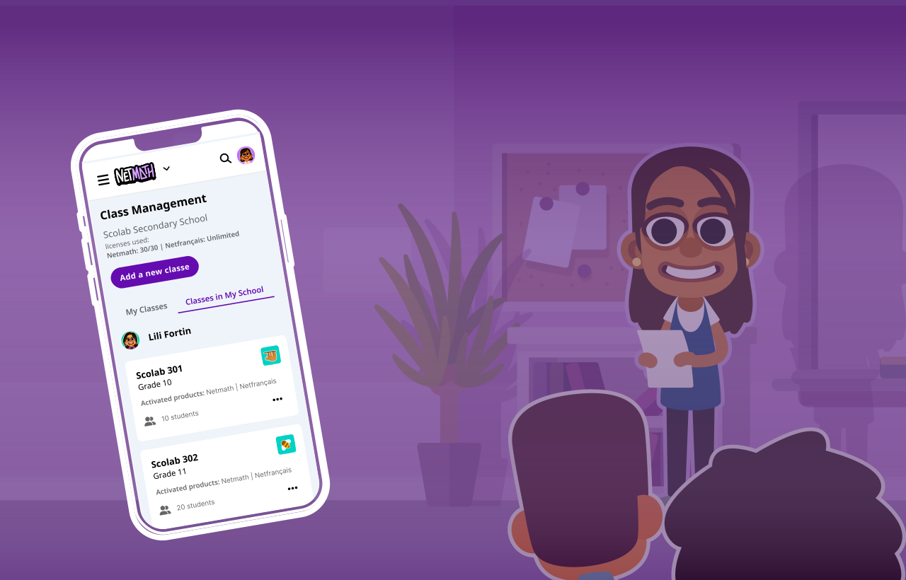
One structure, different themes.
The challenge was to design a scalable experience for multiple age groups with conflicting cognitive and visual needs. Younger users required larger typography, bigger touch targets (minimum 75×75 px), and more saturated, visually driven interfaces, while older users needed a more balanced approach. The challenge was to accommodate these differences while maintaining a consistent structure and avoiding fragmentation across the product.
The goal was to preserve a consistent structure across themes as much as possible, allowing for targeted customization only when necessary.
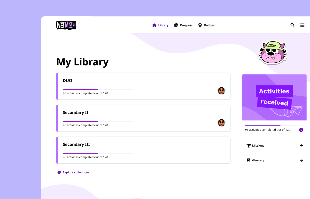
The Library page (homepage) was the main exception, as it required a more significant structural adaptation to better support high school students, who rely more on collections than on assigned activities. As a result, collections were given greater prominence in the layout. Across the rest of the product, components were reused and the overall structure remained largely consistent across all three themes, ensuring cohesion while accommodating different user needs.
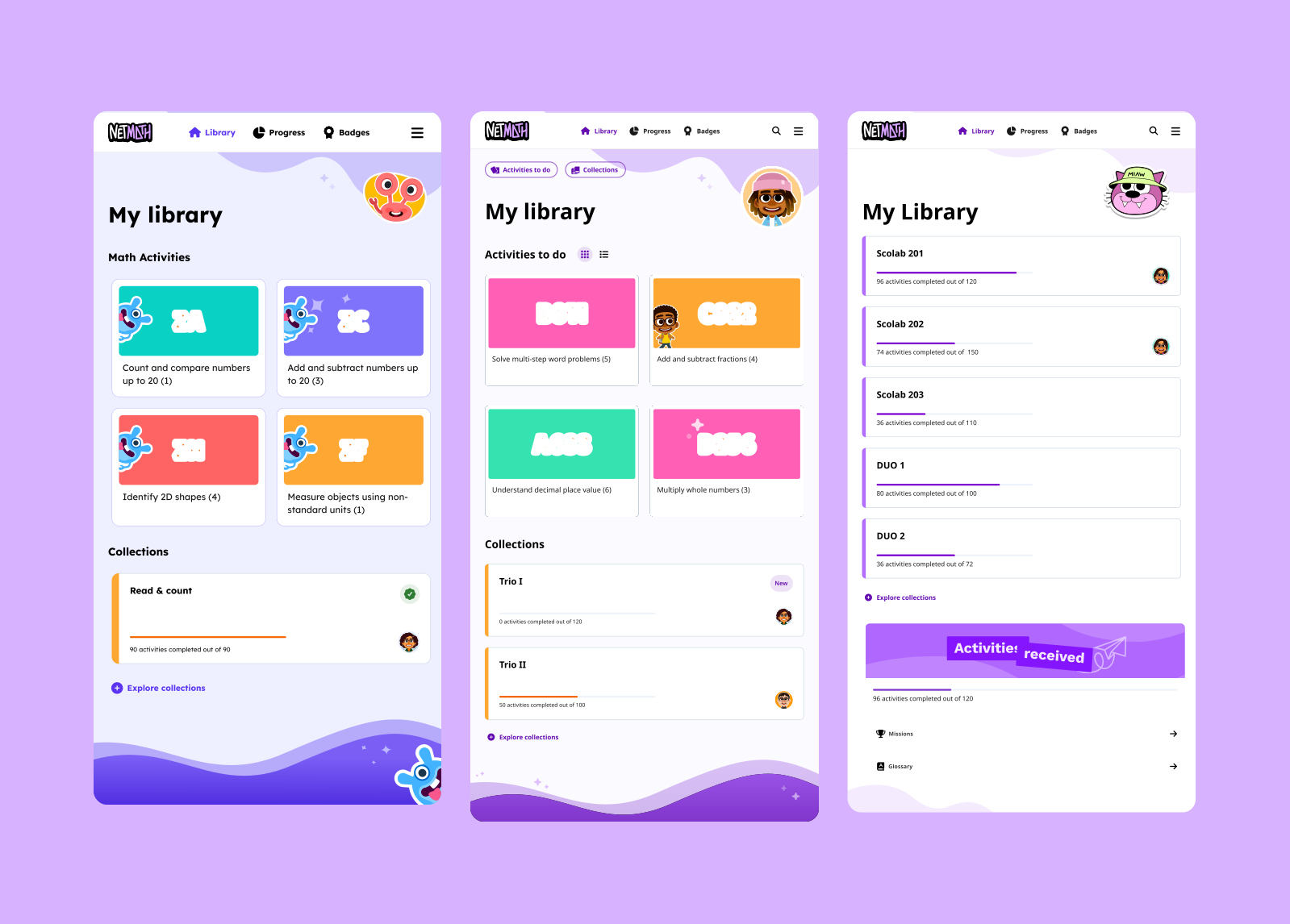

The visual language was tailored to each age group while maintaining overall cohesion across the system.
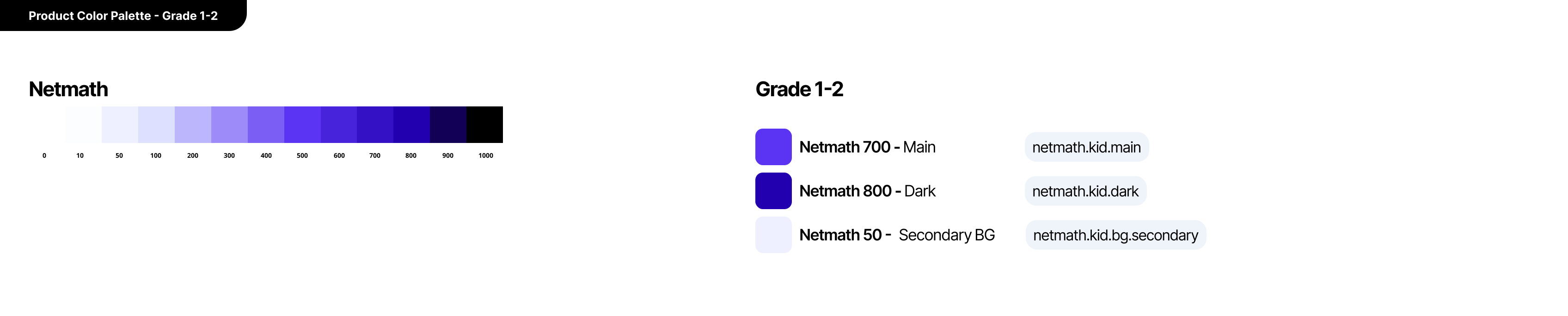
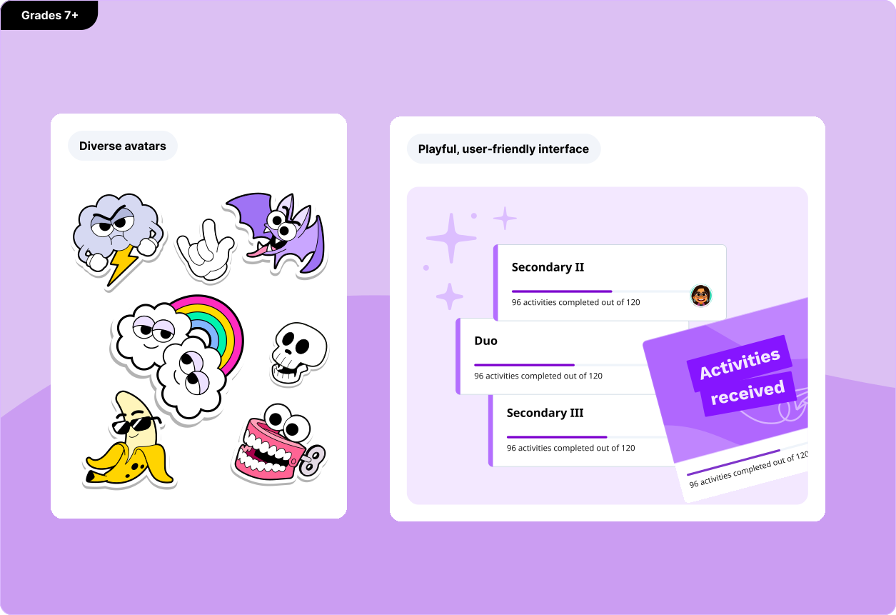
For Grades 1–2, the interface features highly saturated, vibrant, and diverse color palettes, combined with playful monster avatars to create an engaging and approachable experience. For Grades 3–6, the interface retains a colorful and expressive feel, but with a more controlled palette. Avatars shift to illustrated human characters, supporting a gradual transition toward a more mature visual tone. For Grades 7+, the palette becomes significantly more restrained, relying primarily on the core product colors. Avatars are replaced with sticker-style visuals, reintroducing a sense of playfulness while maintaining a more mature and “cool” aesthetic. The product color system also varies across segments. Grades 3–6 and Grades 7+ share the same base palette, with differentiation applied through variables such as primary, dark, and background values. In contrast, Grades 1–2 use a distinct product palette, tailored to their specific visual and cognitive needs.




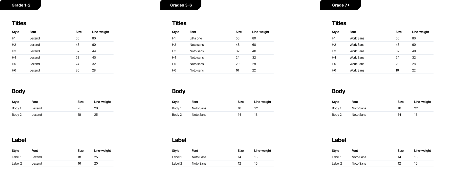
The typography was designed in accordance with age-specific recommendations. For children aged 6–7, the body text type 2 size is set to 18 px, while for children aged 8 and older, it is set to 14 px.
Lexend was specifically chosen to support children aged 6–7 who are early readers and may have lower literacy levels. Its simple, open letterforms, increased spacing, and reduced visual complexity help improve letter recognition, reading comfort, and comprehension, making it well suited for this critical learning stage.


Components were designed to accommodate the differing needs of each age group.
For Grades 1–2, they prioritize accessibility by addressing limited motor skills, with larger touch targets (minimum 75×75 px) and a stronger reliance on visual cues such as icons rather than text-only buttons or chips. Content hierarchy also varies by segment. For younger students, assigned activities are emphasized through prominent card layouts. For older students, collections take priority, presented with more subtle card treatments to support a more mature interface.

By leveraging variables, the redesign supported meaningful adaptations across age groups while reducing implementation complexity.
This made it possible to replicate and tailor the same pages across segments with a significantly faster delivery cycle, approximately 3× more efficient.
Next projects.
(2025-26©)